
Table of Contents
Unlocking the Power of Color in Graphic Design
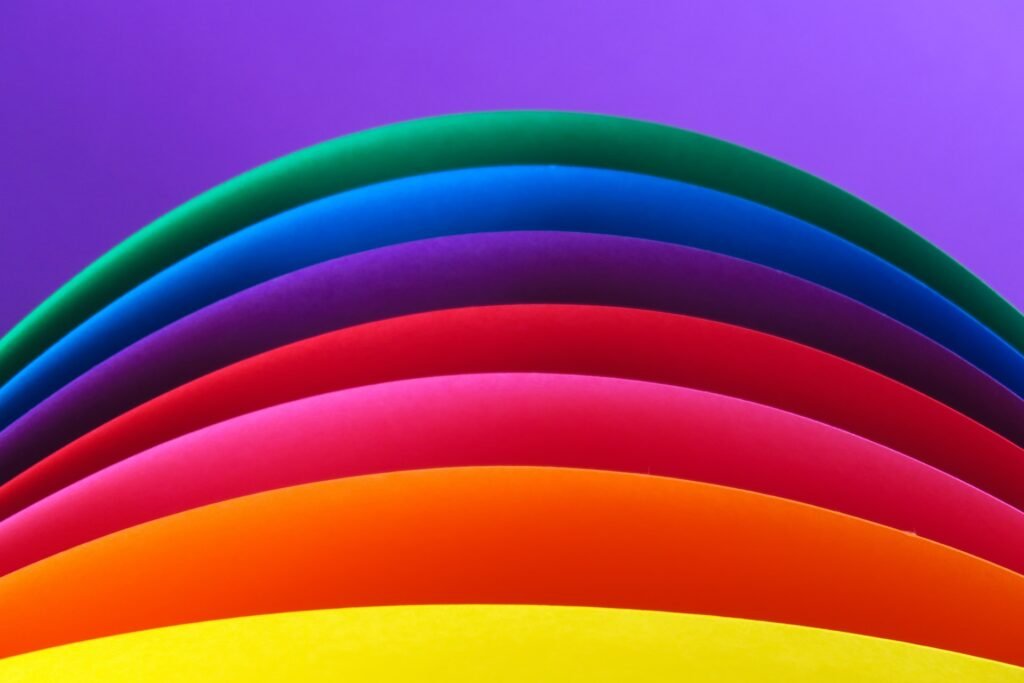
Color plays a crucial role in graphic design and can greatly influence the effectiveness of your designs. When used properly, color can grab the attention of your audience, evoke emotions, and convey a message in a way that words cannot. Every color has its own unique psychological and emotional properties, and choosing the right colors for your designs can help to communicate your message more effectively and leave a lasting impression on your audience. Whether you’re creating a logo, a brochure, or a website, the careful selection and use of color can greatly enhance the impact of your designs and help to achieve your desired results.
The Psychology of Color
In this article, we will dive deeper into the psychology of color and how it can influence the emotions and perception of your target audience. We will explore the different emotions that different colors can evoke, such as red for passion and energy, blue for trust and stability, and green for growth and balance. By understanding the psychology of color, you can create designs that not only look visually appealing, but also effectively communicate your message and evoke the desired emotions in your audience. Whether you’re designing a website, a brochure, or a logo, the right use of color can make all the difference in the success of your design.
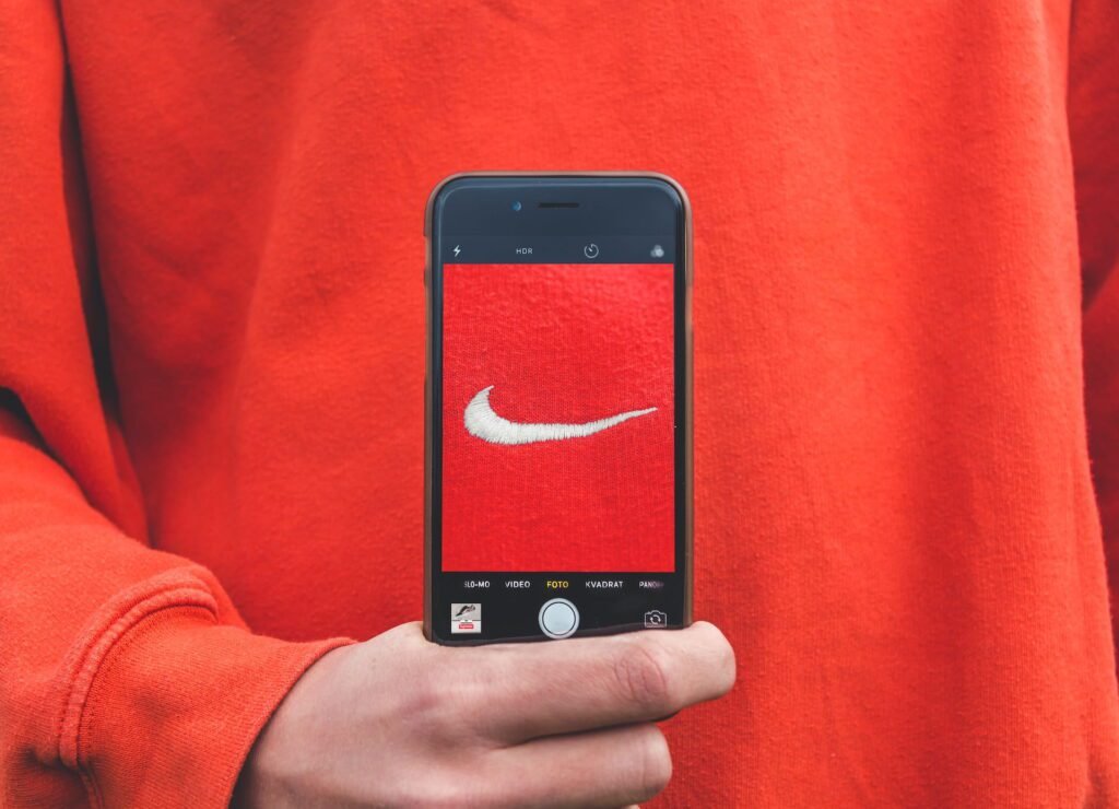
Red: Energy, Passion, and Excitement
Red is a bold and energetic color that evokes passion, excitement, and a sense of urgency. It is often used to grab attention and create a sense of excitement.
Blue: Trust, Stability, and Calmness
Blue is a calming and trustworthy color that represents stability and reliability. It is often used to create a sense of calm and trust, making it a popular choice for financial and healthcare brands.
Green: Growth, Renewal, and Nature
Green is a color that represents growth, renewal, and nature. It is often used to evoke feelings of calmness and tranquility, making it a popular choice for environmental and organic brands.
Yellow: Happiness, Joy, and Positivity
Yellow is a cheerful and optimistic color that represents happiness, joy, and positivity. It is often used to evoke feelings of excitement and optimism, making it a popular choice for children’s brands and toy companies.
Orange: Energy, Enthusiasm, and Warmth
Orange is a warm and energetic color that represents enthusiasm, creativity, and warmth. It is often used to evoke feelings of excitement and optimism, making it a popular choice for sports brands and outdoor companies.
Purple: Royalty, Luxury, and Mystery
Purple is a regal and luxurious color that represents royalty, luxury, and mystery. It is often used to evoke feelings of sophistication and elegance, making it a popular choice for beauty and luxury brands.
Pink: Romance, Femininity, and Playfulness
Pink is a romantic and feminine color that represents romance, femininity, and playfulness. It is often used to evoke feelings of tenderness and playfulness, making it a popular choice for baby products and cosmetics.
Gold: Wealth, Prosperity, and Elegance
Gold is a luxurious and elegant color that represents wealth, prosperity, and success. It is often used to evoke feelings of luxury and opulence, making it a popular choice for jewelry and high-end products.
Brown: Nature, Warmth, and Serenity
Brown is a warm and natural color that represents nature, warmth, and serenity. It is often used to evoke feelings of comfort and stability, making it a popular choice for home decor and furniture brands.
Silver: Modernity, Innovation, and Refinement
Silver is a modern and innovative color that represents modernity, innovation, and refinement. It is often used to evoke feelings of sophistication and elegance, making it a popular choice for technology and automotive brands.
The Crucial Role of Color in Brand Identity
The significance of color in shaping brand identity cannot be overstated. It not only differentiates your brand in a competitive landscape but also weaves a distinctive visual narrative that resonates with your audience. Consider the following:
Emotional Connection
Select colors that evoke the desired emotions and sentiments, harmonizing with your brand’s ethos and personality.
Strengthening Recognition
The infusion of color within your brand’s visual identity enhances recognition and strengthens recall.
Articulating Values
Color becomes a powerful conduit for articulating your brand’s core values and narrative.
Trust and Credibility
Thoughtful color selection fosters trust and credibility, essential components of a successful brand identity.
Consistency Matters
Maintain color consistency across all branding elements – website, business cards, marketing materials – to build a unified and unmistakable brand image.
In essence, color forms the very bedrock of a triumphant brand identity. The colors you choose should harmonize with your brand’s essence, persona, and messaging, creating an indelible and impactful brand presence.
Color in Web Design
In web design, color is used to create visual interest and to guide users through the website. By using color effectively, you can create a website that is visually appealing, easy to navigate, and memorable.
As we design a website, we should think about the colors we choose and how they make people feel. Different colors can evoke different emotions and guide users through the site. For instance, bold colors like red grab attention and create a buzz, while calm colors like blue offer a sense of peace and trust. Mixing colors that stand out can also highlight important things.
Colors also help us prioritize what’s important on a page. By using color to emphasize headings, buttons, and vital elements, we guide users to the most significant information.
When picking colors for a website, we need to consider how they all work together and the emotions they stir. By using colors smartly, we craft a website that’s visually appealing, user-friendly, and unforgettable. This also reinforces our brand’s identity.
Best Practices for Using Color in Graphic Design
To get the most out of color in your graphic design, it’s important to follow best practices and to consider the context in which your designs will be used. Some tips for using color effectively include:
Creating a Color Palette
Creating a color palette is a great way to ensure consistency in your designs and to make sure that your colors complement each other.
Using Color Blindness Simulators
Using color blindness simulators can help you to understand how your designs will appear to people with color blindness and to make sure that your designs are accessible to everyone.
Experimenting with Color
Experimenting with color is a great way to find the perfect colors for your designs and to understand how color can impact the success of your designs.
Conclusion: Unleashing the Power of Color in Your Graphic Design
In conclusion, color is a powerful tool in graphic design that can impact the success of your designs and help to communicate your messages effectively. By understanding the psychology of color and following best practices, you can unleash the power of color in your graphic design and create designs that are visually appealing, memorable, and effective.
Looking for a skilled graphic designer? Don’t hesitate to get in touch with us right away!